37 posters

millennium falcon poster Jerod Gibson created a whole series of posters for a number of movies (and one TV show, so far). Each poster contains the silhouette of an iconic image from that film with a host of quotes contained therein. From the faux distressed backgrounds (which are tastefully muted colors) to the choice of typeface for the quotes, these are real gems.

There are only 12 posters available now, but I look forward to what he might add in the future.
(via Quipsologies)

solar bulb

I sure wouldn't mind having a few of these solar-charged lightbulbs hanging around.
(via Uncrate)

Pantone-inspired Christmas cards

Christmas cards with bold colors that represent different aspects of the season? Yes please.

Check out the Pantone-inspired Christmas cards (and posters).
(via Curatedmag)

Of Alarm Clocks and Volume Controls

Why does an alarm clock's volume control go all the way to silence?

I'm sure it's a matter of time and money savings by using the default range of the electrical component, but it seems strange that you'd ever silence an alarm clock with anything other than the snooze button or off switch.

I promise...

If only I could get everybody who sends email in my office to sign one of these...
(via swissmiss)

UPDATE: Ack...fixed the link.

Time Around

clock cylinder

This clock over at the MoMA Store has me drooling...

Chocolate Pie Chart

chocolate pie chart

This edible info graphic is spectacular. I wonder how it tastes...
(via swissmiss)

Ladle

This is an absolutely brilliant design for a ladle whether it's used for punch or a pot of chicken soup:

[youtube https://www.youtube.com/watch?v=SiPAyU-2wOY&color1=0xb1b1b1&color2=0xcfcfcf&fs=1&w=580&h=470]

(via Gems Sty)

A Functional Heart

In a manner of speaking:

[youtube https://www.youtube.com/watch?v=70dKZjP4NOo&color1=0xb1b1b1&color2=0xcfcfcf&fs=1&w=580&h=470]
(via, etc.)

Shave Yourself!

three pictures of a shaving razor

This past weekend Valerie and I finally stopped by 1601 Overbrook Road at what seems to be a clearing house for estate sales. What you see above is what I bought; a (likely) late-40's Gillette Super Speed razor. I haggled the price down to $3 and we went on our merry way.

Behold the nickel-plated glory.

I purchased a pack of razor blades (also pictured above) and decided to see whether the old-school man tool was barbaric compared to modern shaving implements. After some house work and a good hot shower my face was ready for a clean, smooth, and fresh feeling, so I lathered up my jaw and put blade to skin (don't worry, I sterilized the entire shaver razor by steaming for 5 minutes). I guessed at the proper angle for holding the razor and dragged the head down my left cheek. Other than the light pressure against my face I barely felt anything, so I did a double-take in the mirror wondering whether I'd merely succeeded in wiping shaving cream from my face and little else. Closer inspection, however, revealed a close and even shave where I'd traced, so I finished up.

Shaving my entire face took no longer than a Gillette Fusion or Shick Tracer or what-have-you, and it was certainly more comfortable - and I have very sensitive skin (that is, I can't shave every day without shredding my face, usually). I'm convinced at this point that Gillette switched to cartridge-based systems to increase profit margins.

The whole device is a glorious piece of design, too. You twist the slightly-thicker base of the handle to open the head which opens with a sort of butterfly motion, and lock the blade inside by twisting in the opposite direction. The weight and balance are just right, and the smooth polished surface glides pleasantly across the face. I think my next step is to procure a good shaving brush and some old school shaving cream :-)

Oh, and how could I not share the sweet little artifact that is the instruction manual? The directions are clear, short, and helpful, all in a two inch wide strip of two-color printing (I scanned both sides - there was only one piece of paper):

shaving razor instructions

Brain Baked

Things could be slow this week, folks...

Between a crazy busy work week and crap-loads of work around the house, my mind isn't all there lately.

But I did get something nifty, recently :-)

To the Gills(ans)

There seems to be a fair amount of letterpress type to be had on eBay, and much of it seems to be in gloriously good shape, such as this example from Flickr user h. wren:

metal letterpress type blocks

I think I'd have a hard time justifying the purchase of letterpress type to Valerie, even if it is one of my favorites :-)
(That would be Gill Sans, in case somebody looks at this page long after the eBay auction is gone.)

Stub

Check out this tasty image of 40 old ticket stubs (with Spanish writing, maybe?). There's some pleasant type, a few interesting stamps, and some bright colors - the collected lot of them making a pretty mosaic of what would otherwise be thrown away.
(via RVANews)

Lacking Insight

When I found out that Honda was introducing a hybrid only model for 2010, I was pretty excited. But then I saw a picture of the reincarnation of the Honda Insight:

honda insight

Honda may have been the first to market with a gas-electric hybrid car, but this design sure looks familiar...

toyota prius

I've been a huge fan of Honda for years, but ripping off the Prius design is just weak sauce.

Quiksilver Is My Sauce

So first thing's first...I'm not a surfer, and I never was. I'm not likely to be, either, now that I live a fair clip inland. But growing up near the Jersey Shore I, like nearly every kid around me, wore surf wear brands like Rusty, Ocean Pacific, Billabong, and my personal favorite, Quiksilver.

Additionally, while I like a nice time piece, I've never been obsessed with fine watches the way many fellas seem to be...but today I saw The Ray:

the hottest watch ever

I'm sure when this drop in November it'll sell out quicker than I can blink at a price I can't afford, but I can still appreciate the chrome and ebony.

American Look

This spectacular video highlights American design in the late 1950's:

http://www.archive.org/flow/FlowPlayerLight.swf?config=%7Bembedded%3Atrue%2CshowFullScreenButton%3Atrue%2CshowMuteVolumeButton%3Atrue%2CshowMenu%3Atrue%2CautoBuffering%3Atrue%2CautoPlay%3Afalse%2CinitialScale%3A%27fit%27%2CmenuItems%3A%5Bfalse%2Cfalse%2Cfalse%2Cfalse%2Ctrue%2Ctrue%2Cfalse%5D%2CusePlayOverlay%3Afalse%2CshowPlayListButtons%3Atrue%2CplayList%3A%5B%7Burl%3A%27American1958%2FAmerican1958%2Eflv%27%7D%5D%2CcontrolBarGloss%3A%27high%27%2CshowVolumeSlider%3Atrue%2CbaseURL%3A%27http%3A%2F%2Fwww%2Earchive%2Eorg%2Fdownload%2F%27%2Cloop%3Afalse%2CcontrolBarBackgroundColor%3A%270x000000%27%7D

The funny thing here is that the film was sponsored by Chevrolet. It makes me sad that American car manufacturers can't seem to recapture that emphasis on design outside of a few concept cars.
(via shiphome)

Popping the Days Away

bubble wrap calendar

Almost every year my wife or mother-in-law gets me a calendar at Christmas as one of my gifts. Well this year, if I may be so bold, I want this pop-tastic bubble calendar, on the real.
(via Uncrate)

Ghosts of Cameras Past

I think I just found a new desktop wallpaper for my MBP. It's a design by Gary Gao, the same gentleman who created the "Ghosts of Macintosh Past" t-shirt which John Gruber linked up yesterday. I particularly like how the Yashica Mat TLR (in its leather case, no less!) is right there in the center.
(via Bobby Solomon)

Drawing [in] a blank...

open journal

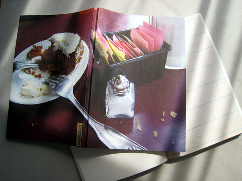
Check out these absolutely gorgeous hand-made notebooks from five and a half. The above, "let them eat cake," may just have to find its way into my hands in short order.
(via Gentle Graffiti)

Cutting Edge Cutting Board Design

Now here's a really clever idea:

cutting board file folder

These are cutting boards with file-folder-style index tabs and color coding by food type. This is a novel idea that looks both well designed and well thought out. But I have a short wish list...

1. I'd prefer they separate fruits and vegetables into two sizes. Have you ever cut fruit on a cutting board even a day after chopping onions/shallots/garlic?
2. I wish they had a bread board in there, too.
3. How about making these available in A3 size, eh? :-)

(via Uncrate)

Delicious Designs

Tonight I'm heading to Delicious Designs with Valerie - an annual event hosted by her trade organization, the American Society of Interior Designers.

At this event folks construct architectural, interior, or furniture elements out of edible materials. I've seen copies of famous buildings, a sagging toilet made out of rice crispy treats, and the totally-not-fair-but-somehow-won-anyway pirate ship made almost entirely out of pickles. Lots of this stuff is super kitschy, some of it's downright stupid, but some of it is quite clever and creative. Valerie is working with some others to construct a sample board, and her part included some "wood" made from chocolate, and "cork flooring" made from two kinds of graham crackers. I'm hoping to get loads of pictures from the event, but considering the low indoor lighting, that may be wishful thinking...

flyer for Delicious Designs

Logo Study: The Momentum Group

Maybe it's a bit pretentious of me to call it a "logo study" since I'm no designer, but I AM analyzing a logo (in my own way, for what it's worth).

Anyway, Valerie was perusing furniture upholstery choices on the website for The Momentum Group yesterday, and I couldn't help but notice how pleasant their logo and brand name are:

momentum group logo

The two things that stand out most are perhaps the most obvious. First the symbol, shaped as a modernistic line drawing of a ball of yarn, contains a subtle "M" within its confines. Second, the brand name is rendered in one of my favorite typefaces, Gill Sans.

Quite a nice effort, I think, though I can't seem to find anything about who designed it (I'll assume for now it was internal).

Scientists If They are Lucky

A Brief Message has a post up this week that I feel quite strongly about. Programs like "No Child Left Behind" increase my desire to be more involved in my own children's education when the time comes. It seems there will be so much left out for the sake of a check list that only caring and involved parents (and the occasional extraordinary educator) will be capable of producing students of cultured and varied learning.

Font Clock

font clock

This clock, designed by Sebastian Wrong (really his name!) is excellent not only for its style, but because it's a freakin' FLIP CLOCK! Sweet! There's a larger version that includes the day of the week, day of the month, and the month name, but something about the proportions of this one and the limit to 2 different type faces at once (more than that gets kinda noisy) strikes my as just right. It's pricey, so it's not in my future, but I guess that's just the price of art.

Book Club

all letters in Book Club typeface

This is a really interesting typeface found by my friend Stephanie called Book Club. It's cool looking, but I feel it's a good example of form over function. That's perhaps the intention, which would be fine. I can't tell from the author's website whether it was a commercial project or proof of concept, but in short artistic applications I could see this having a really cool effect.

I do, however, find it humorous that a typeface created with books is difficult to read :-)